Portfolio
Case Study · Product Design · 2026

PayUrDues

Ryder Product Studio

Community associations have always run on trust — but trust doesn't scale on paper and WhatsApp threads. We designed and built PayUrDues: a platform that brings dues collection, member management, and secure voting into one transparent system.

Read Case Study
Client
PayUrDues
Studio
Product Studio
Deliverable
Web Platform
Discipline
UI/UX + Dev
Industry
Fintech / SaaS
Year
2026
Project Overview //

The problem
was always chaos.

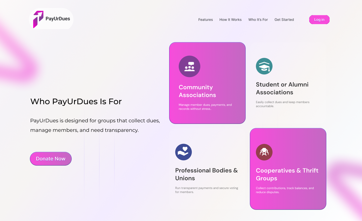
Across Nigeria, thousands of associations cooperatives, alumni bodies, professional unions, thrift groups manage finances through informal channels. Money changes hands on WhatsApp. Dues go unrecorded. Disputes spiral. Votes are contested with no paper trail.

PayUrDues exists to end that. Our brief: design a platform clean enough for a grandmother in a cooperative to use, and robust enough for a 500-member professional body to trust with their finances.

PayUrDues full landing page
Problem & Solution //

Three real pains.
Three clear answers.

The brief wasn't abstract — every problem came directly from how real associations were suffering before a dedicated tool existed.

Pain 01

Dues disappear in the noise

Members pay into a treasurer's personal account. No receipt, no record. Disputes happen months later with no way to verify who paid what and when.

Solution 01

Every naira, on record

Payments flow through the platform and generate instant receipts. Admins and members see the same transparent ledger — no he-said, she-said possible.

Pain 02

Votes are easily manipulated

Association elections held by a show of hands or a WhatsApp poll are contested, pressured, and frequently delegitimised by losing parties.

Solution 02

Secure, auditable voting

Members vote through an authenticated dashboard. Results are logged, timestamped, and permanently visible — building legitimacy and reducing post-vote conflict.

Pain 03

Onboarding new members is chaos

Getting new members registered requires paperwork, group admin intervention, and manual follow-ups. Dropout is high before a member even pays their first due.

Solution 03

One link. Self-service registration

Admins share a secure invite link. Members register themselves, join the association, and pay their first due — all without a single back-and-forth message.

Design Decisions //

Every choice
had a reason.

This wasn't a portfolio exercise. The people using this platform would have low digital literacy, inconsistent data connections, and zero patience for confusion. Design had to earn trust fast.

01

Pink on white — deliberately loud

The magenta-to-purple gradient is not decorative. It signals "this is a payment platform" at a glance — a colour language the Nigerian SaaS market recognises from mobile banking apps. It also ensures CTA buttons are always visible, even on low-quality screens.

02

Three steps, no more

The "How It Works" section is deliberately capped at three steps. Research showed that association admins — who are often not tech-savvy — abandon onboarding when it looks complicated. We hide the complexity; what the user sees is simple.

03

Floating blob backgrounds over rigid grids

The ambient pink blobs in the background are a deliberate softness cue — they make the platform feel approachable and human rather than cold and corporate. For a product handling money, warmth reduces anxiety and increases trust.

04

Two CTAs on the footer CTA — not one

"Get Started" and "Join an Association" serve two completely different user types in one section — the admin who wants to create, and the member who wants to join. Forcing one CTA would lose half the audience every time.

05

The staggered card layout on "Who It's For"

Cards at different heights break the grid rhythm intentionally — it draws the eye across all four categories rather than letting users stop at the first card that doesn't apply to them. Each card earns a second look.

Screen Breakdown //

Five sections.
Each doing real work.

Every section of the landing page serves a specific conversion goal — from capturing attention to building trust to closing the sign-up.

PayUrDues hero section
Screen 01 / Hero

Capture attention in under 3 seconds

The headline leads with the problem the user already feels — dues payments are hard — before introducing the solution. "Simplify Your Association Dues Payments & Voting System" is product copy masquerading as aspiration. The two-CTA layout ("Get Started" / "Learn More") serves both decision-ready and research-stage visitors without sacrificing either.

PayUrDues features section
Screen 02 / Key Features

Five features. One human face.

The feature grid is anchored by a real person — not a device mockup, not an icon set. The woman looking directly at the viewer creates psychological proximity; it says "this is for people like you." Feature cards alternate between purple-filled and white to create rhythm and ensure the eye doesn't skip any row.

PayUrDues how it works
Screen 03 / How It Works

Process as reassurance

The "How It Works" section on a SaaS landing page is really an anxiety-reduction device. The 3D chrome numerals were chosen specifically because they feel weighty and real — subconsciously communicating that each step is a solid, completed idea. The full-bleed magenta background creates a contained "chapter" that makes the flow feel authoritative and distinct from the rest of the page.

PayUrDues who it's for
Screen 04 / Who It's For

Audience segmentation at a glance

Four card types, two staggered heights, two filled and two outlined — the layout does the targeting work automatically. A cooperative member looking for "Cooperatives & Thrift Groups" sees it instantly without reading every card. No one feels like this platform wasn't built for them.

PayUrDues footer CTA
Screen 05 / Footer CTA + Navigation

Convert the ones who scrolled all the way

Anyone who reaches the footer has read the full pitch — they're warm. The final CTA section hits them with a direct headline and two separate conversion paths. The footer itself provides social links, a full quick-link menu, contact details, and legal links — everything a sceptical decision-maker needs to feel safe before signing up.

Delivery //

What shipped.

One Product Studio. One complete, production-ready web platform — designed, built, and handed over ready to onboard its first association.

5
Page Sections
4
Target Segments
5
Core Features
1
Unified Platform

Next project //

Got a product
that needs clarity?

Ryder Product Studio turns complex platforms into clean experiences.