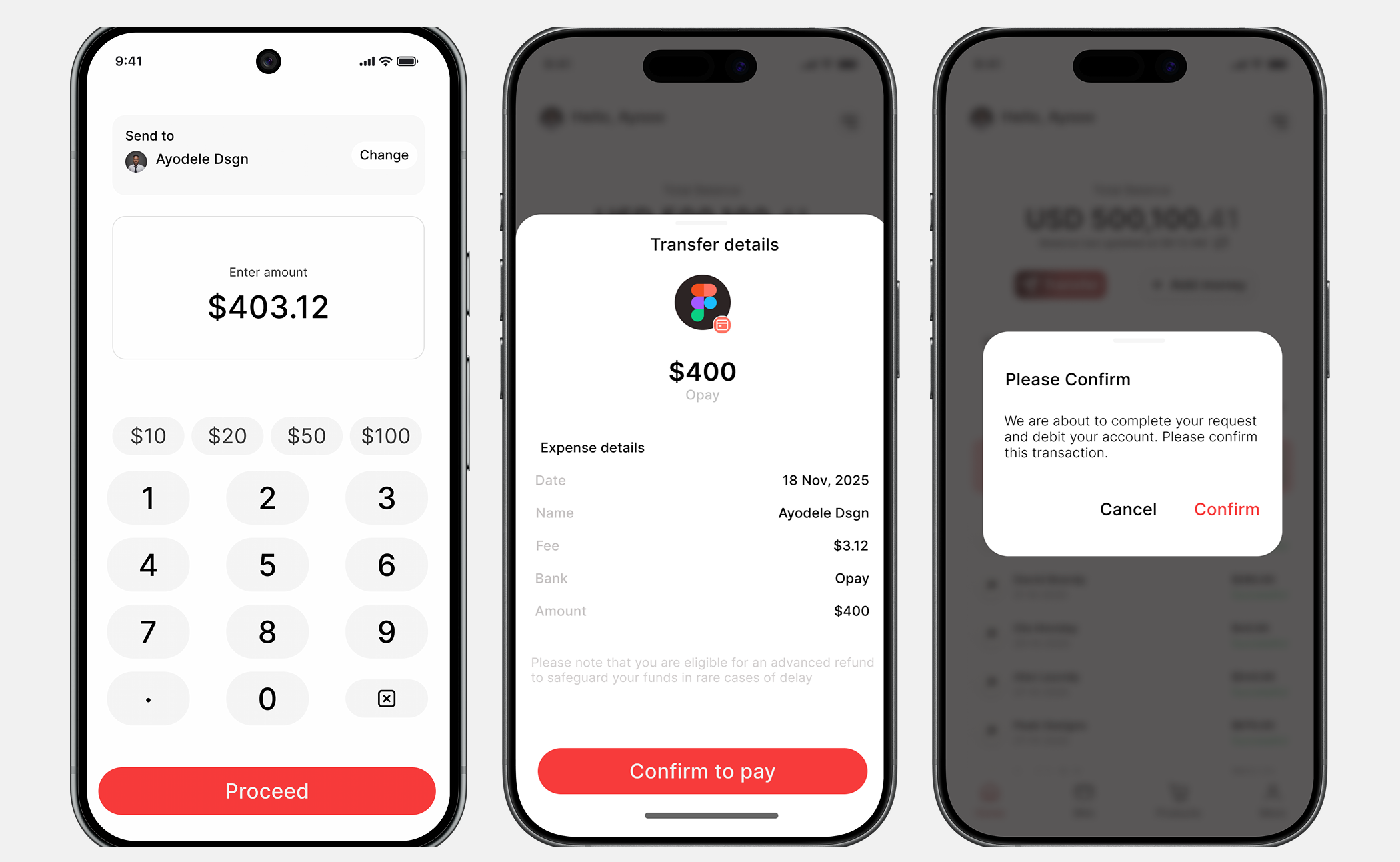
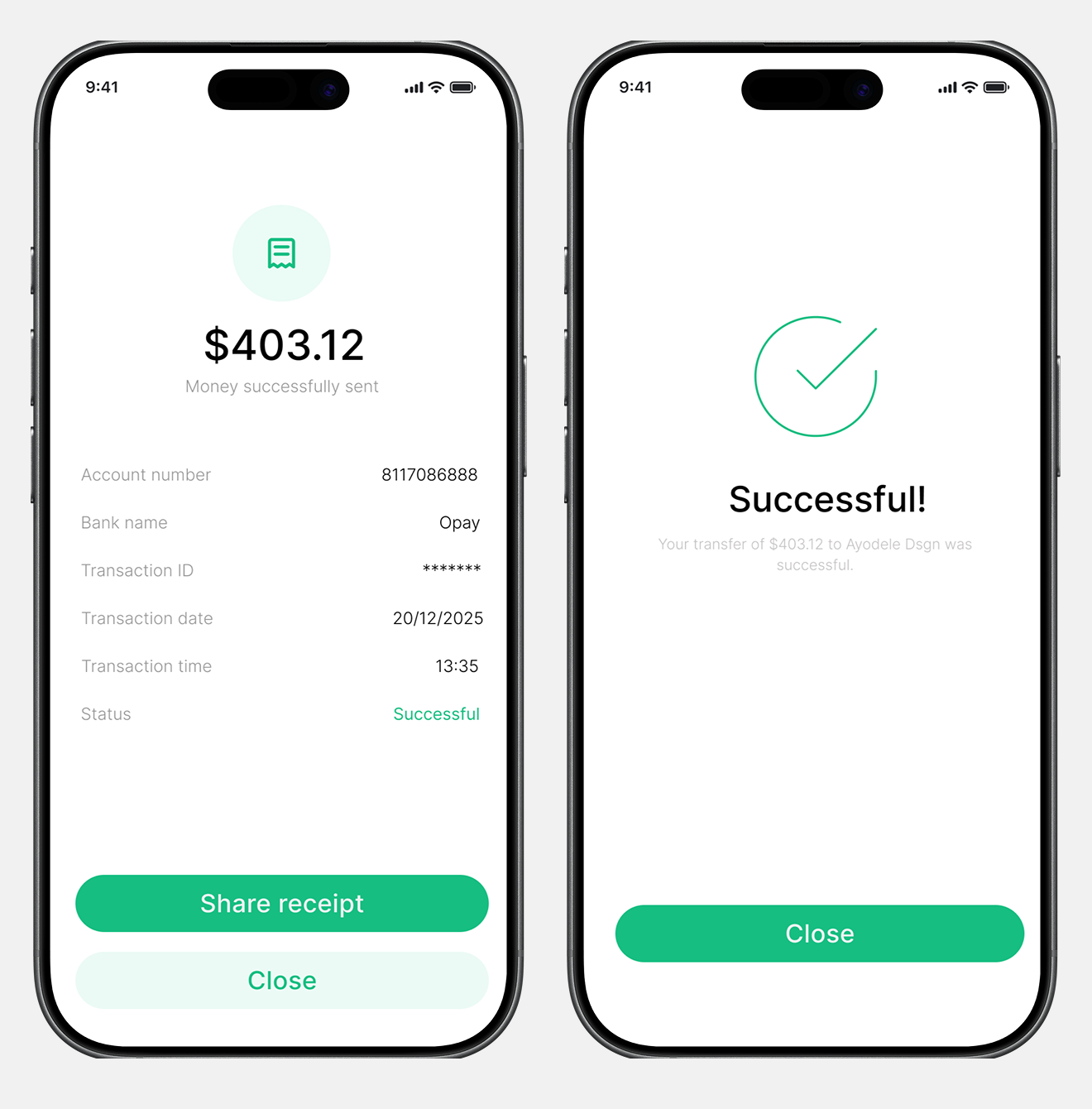
Fintech Mobile App
A digital payment platform designed to simplify how people manage and move money — making everyday transfers feel less like a chore and more like a ride.
Read Case StudyLumina focuses on creating a seamless send-money flow — from onboarding all the way through confirmation — with a strong emphasis on trust, clarity, and reducing user anxiety.
Users hesitate before completing transactions due to fear of sending money to the wrong account, delays, or fraud. A lack of transparency during transactions increases anxiety and reduces confidence.
Trust-building mechanisms were introduced across the flow — clear transaction summaries, account name verification, and immediate visible feedback after every action. The interface was kept clean and distraction-free.
Fintech products sometimes try to do too much at once, presenting users with too many features and visual elements — leading to confusion, decision fatigue, and a poor experience for new users.
A whitespace-first design approach removes unnecessary elements and focuses attention on key actions. Strong visual hierarchy ensures important information stands out, while secondary features remain accessible but unobtrusive.
Each screen in the Lumina flow was designed with a specific user anxiety in mind — and a specific design decision to resolve it.
The onboarding experience was designed to be welcoming, not overwhelming. Clear messaging, minimal inputs, and step-by-step progression keep users moving forward. Progress indicators and concise instructions help reduce anxiety and improve completion.
A clean dashboard surfaces key information — balance, recent transactions, and quick actions — immediately. Strong visual hierarchy ensures users can scan and understand their finances in seconds, without scrolling or searching.
A transparent confirmation screen shows all transaction details clearly before sending. This allows users to review and edit information, increasing confidence and dramatically reducing entry errors and accidental transfers.
A clear success state with immediate visual confirmation reassures users that the transaction is complete. Strong cues prevent repeated actions and reduce anxiety — the user knows exactly what happened and what to do next.
Inter was chosen for its legibility at small sizes and neutral tone — perfect for a financial product where information density is high and trust is paramount.
Next Steps //
Let's build something together.